It’s heeeeere! I have a new WEBSITE DESIGN, omg. F f f finally.
And also, welcome to the most Inception-y post you may ever see. Photos of my new site, on my new site. The new logo, right under the new logo. The new menu bar, right under the new menu bar. Part of an ad, right next to an ad. We should probably just go ahead and pour a glass of wine. You know what, just hand me the bottle.
I am obnoxiously thrilled over this redesign. The stripped-down look and feel is exactly what I’d hoped for. I wanted nothing more than a simple, easy-to-use, no-frill blog that you can get around quickly and find exactly what you want.
Let’s take a quick tour, shall we?
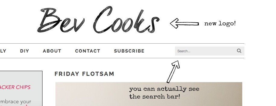
New logo! My girl Michelle at Mockingbird Creative was the brains behind this entire project. She’s ridiculously talented, can rock smokey eyeliner like nrobrooodry, and can write the poppiest country song in like, five minutes flat. She was actually in Aaron’s old country band back in the day! I actually used to play music with her, too. I actually even lived with her for a few summer months in my mid-20s. She once folded my tube tops in hysterics, “These look like tiny dishrags, Bev! TINY DISHRAGS.” If I tried to put on a tube top post twins I’d cry until 2074.
So! Check out the menu bar at the top. There’s a section for Food, Family and DIY. Sumpin’ fer errrone. And can we just look at that search bar? It’s visible, it’s long, it actually says search. Big time, you, guys.
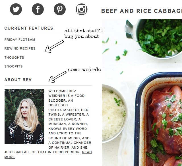
If you take a looksie over to the left, you’ll see a little column of my current features! So if you’re like, “Wait, what was that old recipe she was talking about how she thought canned clams were going to give her night terrors?” – bam, Rewind Recipes. Or if you’re like, “What was that one Flotsam post about that brie and tomatoes malarkey in cornbread, and involuntary chest punches?”- pow, Friday Flotsam. Or if you’re like, “Hey what was that one thing she said about one pregnant leg being on one side of the Mississippi, and the other leg on the other side?” – biggidy, Thoughts. Or if you’re like, “Remember that time she started a Snoopits series and forgot all about it?” – boom, Snoopits.
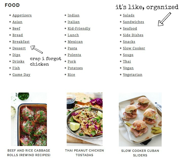
How about, under the Food category, there’s an actual working recipe index with pretty little thumbnails right below of the recipe archives. Well, except I forgot chicken. How does one forget chicken? I’ll email Michelle in a few minutes.
Alsoooo, now it’s crazy easy to subscribe to my posts. AND you’ll probably even GET my posts because I switched mail services. Winners for days.
My About Me page is thorough, up to date, contains my promotional video, and probably a photo of ze babies. Wat UP.
So there you have it! Noodle around a bit. Play with it. Try shooting me an email if ya want. I’d love to hear any and all feedback you have! I will say, one thing I spaced on was a printing option, so we’ll get that tackled shortly. Right . . . right after this glass of wine.
I’ll never be able to thank Michelle enough for designing such a clean and tidy space for me. And thank you to YOU for coming here and making it possible for me to HAVE this little clean and tidy space. I sure do dig you all.
Now, how about a refill?


28 Responses to Bev Cooks New Site Design!